How to make an outstanding Counter Design? Follow these 2 examples!
What are the criteria for a good counter design? Authenticity? Practicality? Or Marketing ability? Counter design is actually an art form composed of space management and products display. We need think more than just the design level but also the balance in between authenticity and marketing value. No matter in booth or business space design, always remember to think of all these criteria at the beginning phase of the plan in order to bring out the best quality of counter design.

What is Counter Design?
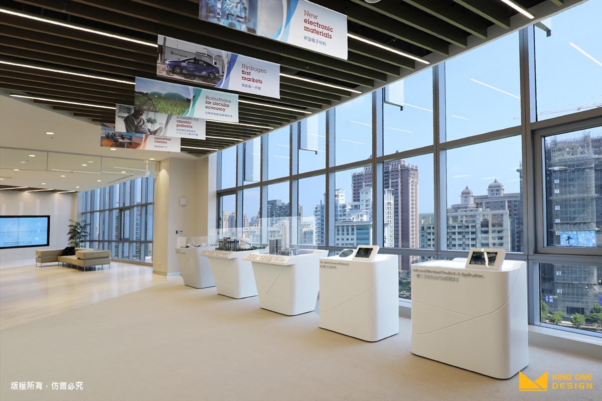
Counter Design, literally, means a design process for counters. It is seen as a art form of composed of space management and products display. To pursue this goal, you could tell this is more than just on design level; therefore, you need to go deeper and plan from overall perspective. Also, discussion and communication are the keys to building a great counter design. Keep these in mind, and you will start counter design more easily.
Where do you need Counter Design?
Commercial Space
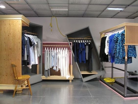
Commercial Space, such as retail stores, clothing shop and cosmetic shops, needs to focus on “product display.”Due to low price and fast purchase process, the design needs to be simple and neat lines to present a sense of space, plus functional-oriented design, to display more products.
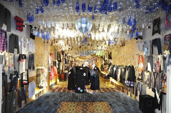
Another type of commercial space is flagship stores in department stores or malls. Customers are buying more than the products but also the additional value, so you need to focus on creating the“atmosphere.”In the space, the rendering of the atmosphere and customized designs are required to help create a shopping, entertainment, and leisure space environment for TA.
Short-term Exhibition or Pop Up Store
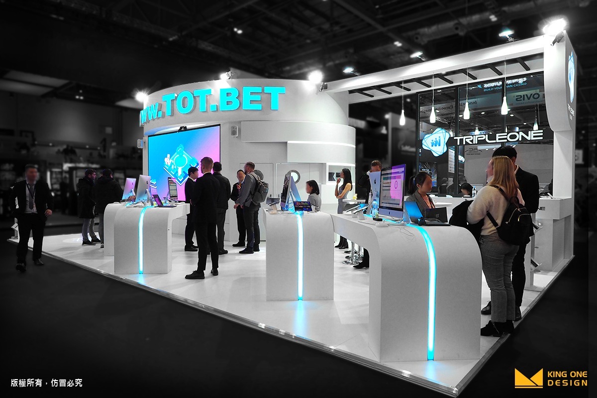
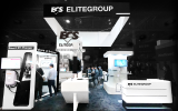
Exhibition booth and situational booth design are commonly seen cases that needs good counter design. The customers are professional buyers, sellers, and corporate. Therefore, we want to focus on showing brand image. Following CI and VI, also incorporating creativity can enhance the rendering of the booth atmosphere, leading the participants to enter the booth space in line with the brand tonality
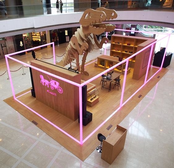
Another type is pop up store. TA is mass public. The main focus for counter design, on the other hand, is themed design. Also, pop up stores need a lot of customized counters to make it pop out and catch the attention from the public. Other than this, the mobility of the counter should especially be highlighted as well because there will be so many emergency happening on site.
3 Points for Counter Design
Purpose:
What is the purpose of our counter? How long these counters are going to stay? Is it for short-term campaign or long-term branding? With different purposes, the design methods and directions may differ. So remember to clear out the mind for this before starting the plan.
Functionality:
Don’t forget about the functionality in counter design. If you want to maximize the space, you have to own a profound marketing plan that gives clear directions on traffic route and rendering. Also, even with different seasons, the display may change accordingly! Keep these ideas in mind, only in this way can the space complement the counter and maximize the benefits!
Theme:
Counter design needs to go with themed and seasonal campaign in order to bring out the atmosphere. Remember to refer to and compare whether the creativities conform to the overall atmosphere and whether they have a strong visual impact to wow the customers. Only continuous reflection and discussion can complement each other and create a brand-specific counter design that greatly increases brand exposure.
Case Study
Exhibition Booth - CES2019 TAITRA (Smart Retail)
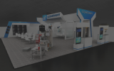
TAITRA presented the theme of “SMART RETAIL,” bringing the whole shop into the CES exhibition hall. Visitors would see the exact same interior design of a real store from Taiwan. The wooden texture pillars and walls added the warmness to the booth. The eye-catching fascia sit on the one side of the booth, drawing attention with its shiny graphics. Following the guide of the fascia, the visitors got the chance to both shop as a customer and operate the smart retail system as a clerk at the same time!
Food Stands - AbbVie
The main challenge of AbbVie is atmosphere. King One Design was the designer and contractor for AbbVie annual medical seminar in 2016. Here, we are going to put focus on the recreational area. The structural design and routes are the keys to making the atmosphere more relaxed, putting the hustle and bustle from the busy working life aside and enjoy the getaway moments.
Another challenge is the food counter. AbbVie hopes to set up multiple and diverse choices of food stands, offering drinks, ice sticks, for the busy doctors. However, the catch is that we only have limited space. You may wonder how much space you need for a simple food stand. Well, one thing about food stand is that you need a PERFECT route for food supply and storage space. Thanks to our professional skills in small space, big design in exhibition booth, we still managed to arrange everything with accurate measurement to maximize the use of space, and finally build a successful international medical seminar.
- 1
6 Different Types of Trade Show Booths You Need to Know
Brand Strategy
- 2
What is CIS? Corporate Identity Design that goes hand in hand with exhibition design
Tech Life & Trends
- 3
What you need for Situational Design - 2.5 D
Exclusive Perspective
- 4
Introduction of 3D Logo
Exclusive Perspective
- 5
3D Logo - The Little Secret in Exhibition Design
Exclusive Perspective
- 6
What is the definition of Experiential Marketing? From 5 perspectives, you will get it!
Tech Life & Trends
