TOP 3 Color Choices for Exhibition Design
“Red: the blood of angry men!
Black: the dark of ages past!
Red: a world about to dawn!
Black: the night that ends at last!”
(quoted from musical Les Misérables)
A good beginning is half the battle. In terms of design, it is color that makes the beginning good, and then we get to talk about the rest.
In the world famous musical “Les Misérables,” you could see how the characters referred red and black to rage and anger. This is what Color Psychology exactly all about – how different colors influence people’s mind individually.
It’s just so easy to implant the ideas of color psychology into any design project that people would not notice them at all; moreover, they probably don’t know they are already under the influence of color psychological control.
As a design company, King One Design concludes three top-used color in exhibition booth/stand design, showing you how to combine color and the brand image in order to create the most eye-catching booth/stand in the exhibition.
Here are the TOP 3 color choices for exhibition design:
- Earth Color Tone
- Contrast Color Tone
- Ultra Red
We will be covering it one by one through our recent case work – Eurobike Exhibition.
♦ Earth Color Tone – Nature and Comfort
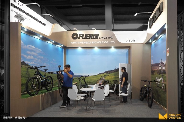
First, we’d like to introduce the most suitable color tone for the bike brand: earth color tone! The earth color gives people the sense of comfort and nature texture. It releases people’s tense and nervousness.
Chinese brand FUERDI chose earth color tone as their main color tone; to add a touch of more nature texture, they also printed blue sky and wild field on the back panel. The overall style conveyed a relaxing and comfortable atmosphere as if you could breath in all the fresh air from the nature. What a perfect combination, the relaxing atmosphere and the nature texture of earth color tone! It showed the true spirit of FUERDI.
♦ Contrast Color Tone – Eye-catching and Energetic
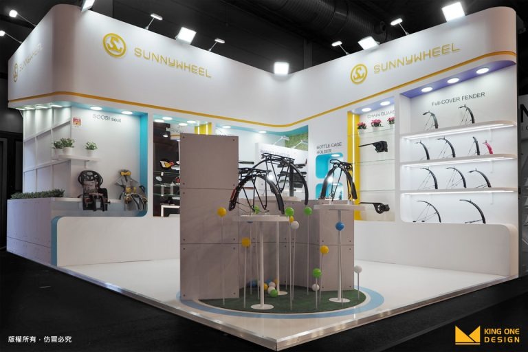
Among all the other fancy booths, how to create an eye-catching booth is always the first purpose that we think about! Sometimes simplicity could do the favor, but… maybe we need some “contrast” to help a little bit.
Yes, using the white color in majority part of the design, however we added a slight of tint yellow and sky blue into it for the purpose of pursuing the sense of contrast energy. Besides, SUNNYWHEEL is a brand with a lot outdoor vibrancy, so we created a small circular shape of artificial green area with colorful little balls to highlight the booth.
♦ Ultra Red – Speed and Powerful
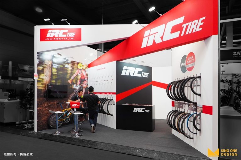
Last but not least, the most powerful color of all – Ultra Red! Generally speaking, red is not a common main color tone we would use in booth design because it is just too dominant, and people would easily get attracted, yet at same time, the eyes would easily get tired when staring at it for a period of time. However, this is an exception!
Famous Japanese bike brand IRC boldly chose Ultra Red as the main color tone for the booth. With two triangle banners, the speed and power was conveyed through the color red and the sharpness of triangle. Furthermore, for the purpose of reducing the intensity of red and tiredness of staring it, we used white to complement with red. The overall design brought out the professional side of IRC and the powerful side of the brand at the same time.
These TOP 3 used color choices are the best examples of how color psychology implanted in to booth design and showed the intentional image to the attendees. KingOne Design always put our client in first place and build the design based on their needs, including graphic design, to offer complete and diversity of custom-made service.
- 1
6 Different Types of Trade Show Booths You Need to Know
Brand Strategy
- 2
What is CIS? Corporate Identity Design that goes hand in hand with exhibition design
Tech Life & Trends
- 3
Introduction of 3D Logo
Exclusive Perspective
- 4
What you need for Situational Design - 2.5 D
Exclusive Perspective
- 5
3D Logo - The Little Secret in Exhibition Design
Exclusive Perspective
- 6
What is the definition of Experiential Marketing? From 5 perspectives, you will get it!
Tech Life & Trends
