Let The Banner Do The Talk!
If one banner could do all the talk, you would rather sit and see the traffic flow in, or what?
Every time you walk into an exhibition event, it’s just like a huge party throwing right at your face. You could see the vibrancy. You could hear the noise. You could sense the energy. The only thing you could NOT feel is the concentration on which booth you want to go, right?
As an international exhibition booth/stand design company, King One Design would love to introduce you the best silent speaker that does all the talk for you and draws the attendees to come and visit the booth – the banner!
Let the banner do the talk!
The banner has been a perfect example of a silent speaker for any marketing campaign since its ever created. It not only gives the attendees the first impression of the brand but also represents the brand image and service.
A good banner design has a lot of details to concern, including the material, the color tone, and the most important of all – the brand image because you only get one shot to shoot into the attendees’ heart and lure them into your booth.
Now, we are going to guide you to see the two “Let the banner do the talk!” examples that KingOne Design did in the past. Let’s talk about the Material first!
Let’s talk about – Material

This is APPP EXPO. We worked with our client NANO to build an eye-catching “Flashy Fabric Column” as the key vision, not with commonly seen material – wood, but fabric!
The Flashy Fabric Column, made from ten stretches of four different types of fabric, was connected from the top panel to the floor, striking up in the middle of the booth as the best banner. What’s more, the unique color of the fabric was printed with NANO ink, which totally spoke for NANO and shows the uniqueness and the strength.
From the chosen material to the idea of Flashy Fabric Column, King One Design let the banner do all the talk and allow the attendees to see all the creativity and best quality of ink from NANO within one glimpse.
Let’s talk about – New Tech.
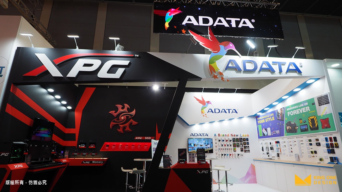
In IFA, we worked with ADATA. Instead of traditional material – wood, we chose to new tech LED banner to show the innovative image of ADATA.
What makes a LED banner stand out is that it moves! Just that simple! Imagine there is a flying bird and a standing bird, which one would draw more attention from you? Without any doubt, your eyes would be drawn to a moving object more easily; and here, we animated the ADATA logo – the bee bird and also slide-showed the sub-brand XPG’s image in one banner.
Just in one banner, it showed two brands at the same time. Without further explanation, the attendees got to see the vivid brand image from the hanging LED banner and learn the corporate features in one sight.
And now, you rest!
With a perfect banner design, the talks are done, the attendees are flowing into the booth, and us, King One Design would make the banner talk and take care of all the other details related to the exhibition presentation. As for you? Go get some rest!
- 1
6 Different Types of Trade Show Booths You Need to Know
Brand Strategy
- 2
What is CIS? Corporate Identity Design that goes hand in hand with exhibition design
Tech Life & Trends
- 3
Introduction of 3D Logo
Exclusive Perspective
- 4
What is the definition of Experiential Marketing? From 5 perspectives, you will get it!
Tech Life & Trends
- 5
Five creative ways to enhance your booth appeal
Tech Life & Trends
- 6
What you need for Situational Design - 2.5 D
Exclusive Perspective
